

Improve ecommerce checkout by fixing a verified obstacle: unclear product fit, late disclosure of delivery costs, a broken mobile form or an uncertain payment result. Start from the shopper's decision and the order's actual state, then measure completed purchases and downstream mistakes together.
This guide uses an illustrative retailer with product variants and regional delivery. It combines purchase-information decisions with a checkout recovery matrix you can use in a provider-supported test environment. The examples define behavior to verify; they do not promise a conversion uplift or report client results.
Key takeaways
- Find the actual point of uncertainty before changing visual details.
- Keep price, stock, delivery, and product information consistent across the journey.
- Treat checkout retries, payment confirmation, and order recovery as core product behavior.
- Measure completed, supportable orders rather than optimizing clicks in isolation.
Understand the purchase decision and its friction
Observe how shoppers choose products and what information they need before committing. Review search queries, support questions, abandoned steps, and returned orders. A high exit rate can have several causes, so use qualitative evidence to interpret the numbers.
Map the journey by customer intent. A returning buyer searching for a known item behaves differently from someone comparing options for the first time. The interface should support both without forcing every visitor through the same promotional sequence.
Identify uncertainty rather than assuming every delay is bad. A shopper may need dimensions, compatibility, ingredients, warranty details, or a realistic delivery estimate. Making those answers easy to find can be more useful than shortening the page indiscriminately.
Define a baseline before experimenting. Track meaningful steps such as product selection, cart creation, checkout start, payment attempt, and confirmed order. Include device, region, and acquisition context where appropriate and permitted. This helps the team avoid attributing a broad business change to one interface adjustment.
Create a catalog that supports confident discovery
Use consistent product attributes and category names. Filters only work when the underlying data is complete and comparable. A retailer cannot offer a dependable material or compatibility filter if half the catalog uses free-text variants of the same concept.
Design search for the language customers use. Include common names, identifiers, and useful synonyms, and provide an understandable response when no exact result exists. Avoid filling an empty result page with unrelated products that make the search appear broken.
Preserve filter and sort state when users inspect a product and return. On mobile, make applied filters visible and easy to remove. A shopper should not need to reconstruct a comparison after every navigation.
Give merchandising teams tools to maintain the catalog without introducing inconsistent layouts or missing information. Validation for required attributes, image quality, and variant relationships can prevent customer-facing problems before a product is published. The administration experience is part of storefront quality.
Make product pages answer the important questions
Organize information according to the purchase decision. Show the product identity, price, selected variant, availability, and primary action clearly, then provide the details needed to assess fit. Do not hide essential limitations in an unrelated accordion or a distant policy page.
Use images that represent the actual product and its relevant details. Provide useful alternative text where an image conveys information, and avoid relying on imagery alone for specifications. If a visual is illustrative rather than the exact item, make that distinction clear.
Handle variants as real inventory and pricing choices. A color or size change may affect stock, images, delivery, and price. Update those elements together and ensure the selected variant remains clear in the cart and order confirmation.
Present reviews and claims honestly. Show verified information according to the business’s actual review process, and do not invent ratings or customer outcomes. Confidence comes from accurate evidence and understandable terms, not from filling every page with trust badges whose meaning is unclear.
Keep pricing and delivery consistent
Explain material costs early enough for a shopper to make a decision. Delivery charges, taxes, subscriptions, deposits, or minimum quantities should not appear as unexplained surprises at the final step. The exact presentation depends on the market and product, but consistency is essential.
Use authoritative server-side pricing and validate the cart before accepting an order. Client-side calculations can provide immediate feedback, but they should not determine the final amount independently. Discounts need clear eligibility, expiry, and combination rules.
Represent delivery estimates according to the information actually available. If an estimate depends on location, ask for the relevant location or explain the limitation. Do not display a precise promise that the fulfillment process cannot support.
Test edge cases such as a promotion expiring during checkout, stock changing after an item enters the cart, and a region becoming unavailable. Give the shopper a clear explanation and a path to revise the order. Silent changes to totals or variants undermine trust even when the backend calculation is technically correct.
Design the cart as a decision and recovery space
A cart should make the chosen items, variants, quantities, costs, and next step easy to review. Let users correct mistakes without losing unrelated work. Show unavailable items and changed prices explicitly rather than allowing checkout to fail much later.
Preserve the cart appropriately across navigation and sign-in. Decide how guest and account carts merge, especially when the same item appears with different options. Avoid surprising quantity increases caused by a merge rule that simply adds everything together.
Make removal and quantity changes responsive while keeping server state authoritative. If an update fails, restore or explain the actual state. An interface that visually removes an item while the server still charges for it creates a serious mismatch.
Support a return journey without excessive pressure. Saved items, a useful email link when authorized, or a persistent cart can help shoppers continue. Avoid messages that falsely imply an item is reserved or about to disappear when the system does not actually enforce that condition.
Improving your purchase journey?
Bring the purchase friction and payment-recovery cases you need to resolve. We can help scope the product and engineering work.
Reduce checkout effort without hiding important choices
Ask for the information needed to fulfill the order and support the selected payment method. Group fields logically, use appropriate input types, and explain unusual requirements. A phone number request should have a clear purpose rather than appearing as an unexplained mandatory field.
Support guest checkout when it fits the business model, and avoid forcing account creation merely to collect credentials before a first purchase. If an account is necessary, explain why and keep the process focused. Offer a sensible recovery path for returning users who cannot remember a password.
Make errors specific and preserve entered information. Identify the field or condition that needs attention, associate the message with the control, and avoid clearing the whole form after one invalid value. Test keyboard navigation, screen readers, and small screens throughout the process.
Review the order clearly before the consequential action. The shopper should understand what they are buying, the total, the delivery arrangement, and any recurring commitment. A shorter checkout is not better if it removes information needed for an informed purchase.
Treat payment and order creation as a coordinated workflow
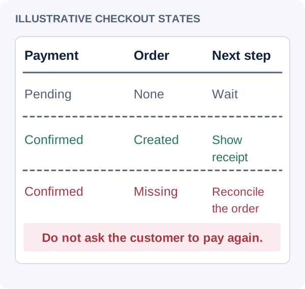
The browser returning from a payment flow is not the only source of truth. Connect the provider's verified payment state to the order, inventory and fulfillment records. Distinguish a pending operation from a declined one; an uncertain network result should not automatically invite the shopper to pay again.
For example, Stripe documents idempotency keys for supported API retries and warns that webhook events can be duplicated and arrive out of order. Verify signatures using the provider's supported procedure, record processed events and make fulfillment idempotent as well. A payment-request key does not by itself make your order-creation or shipping code execute once.
Link one checkout operation to its provider payment and order identifiers. If the payment is confirmed but the order is missing, reconcile that operation or escalate through the documented recovery path. Test in the provider's supported test environment, including a tab closed before the return page loads. The shopper should see a recoverable status consistent with the server's record.
Stripe: webhook delivery and event handling
Stripe: idempotent API requests
Payment success and order creation are separate facts
Make post-purchase communication part of the product
A confirmed order should provide a stable reference and an understandable summary. Explain what happens next and where the customer can find status or support. A successful payment followed by an empty account page creates uncertainty at the moment trust matters most.
Keep order status aligned with fulfillment. Avoid labeling an order shipped merely because a label was created if that does not match the business’s meaning. Define status vocabulary with operations and support so customers receive consistent explanations across channels.
Design returns, cancellations, and corrections according to the actual policies. Make eligibility and next steps visible without forcing customers to search through unrelated content. A support workflow should preserve the order context and show what actions have already occurred.
Use operational feedback to improve the purchase journey. Repeated returns due to misunderstood dimensions indicate a product-information problem. Frequent address corrections may reveal a form issue. Conversion work should include the quality of orders after checkout, not only the number completed.
Measure experiments with safeguards against misleading results
Define the funnel before changing checkout: product selected, cart created, checkout started, payment attempted and order confirmed. Count unique checkout operations rather than every tap or page reload. State the observation window and separately track pending operations so delayed confirmation does not become an unexplained conversion loss.
For a checkout experiment, one candidate outcome is confirmed orders divided by eligible unique checkout starts. Keep returns, mistaken variants, support contacts and duplicate charges as guardrails. Segment by relevant device and market where the data and consent permit; a different campaign or stock position can change the mix independently of the interface.
Use the recovery matrix before running a conversion experiment. It is an illustrative acceptance checklist, not measured evidence. Fix a reproducible failure first. For traffic-based comparisons, define the hypothesis and analysis plan in advance and avoid causal claims from small or self-selected samples.
| Scenario to reproduce | Customer-visible outcome | Server evidence |
|---|---|---|
| Payment request times out after submission | Pending status with a way to check the existing operation. | Reconcile the same payment and checkout IDs before allowing a new payment. |
| Shopper taps twice or retries | One checkout operation and an understandable status. | Supported idempotent request retry; no duplicate order or fulfillment. |
| Confirmation webhook arrives twice | The same confirmed order remains visible. | Processed-event record and idempotent fulfillment prevent repeat effects. |
| Related events arrive out of order | Status reflects verified current payment and order state. | Reconciliation does not assume event delivery order. |
| Payment is confirmed but order creation fails | Recoverable pending order or a support path; no instruction to pay again. | Tracked reconciliation recovers the order or records the approved resolution. |
| Stock or delivery price changes before commitment | Show the change and require a decision on the updated total. | The committed order uses the price, currency and stock policy actually accepted. |
Check accessible forms and status messages across the purchase journey
Build a performance and accessibility maintenance loop
Monitor the experience after adding new media, marketing scripts, filters, or checkout integrations. Storefront performance can gradually deteriorate as individual additions accumulate. Set budgets and review the combined effect on representative devices and connections.
Use accessible shared components for forms, dialogs, navigation, and status messages, then test the complete purchase journey. A third-party payment or address widget can introduce a gap even when the rest of the site works well. Include these boundaries in release checks.
Prioritize work according to customer impact. Fix broken variant selection, unclear costs, and unreliable payment recovery before spending substantial time on decorative animation. A strong ecommerce experience is a coordinated system of information, interaction, and fulfillment. Design and engineering improve conversion most sustainably when they make that system easier to understand and more dependable.
Frequently asked questions
What is the fastest way to improve conversion?
First identify the largest verified friction point. It may be unclear product information, unexpected delivery costs, a broken mobile form, or a payment error. Fixing an observed problem is usually more defensible than changing button colors without evidence. Establish a baseline and check downstream order quality as well as purchases.
Should every store have a mobile app?
No. A reliable responsive website may serve occasional buyers well. A mobile app becomes more compelling when repeat use, loyalty workflows, device capabilities, or a distinct member experience justify its ongoing cost. Validate those needs rather than assuming an app will automatically create retention.
Can AI recommendations increase sales?
They may help customers find relevant products, but value depends on catalog quality, relevance, and the purchase context. Compare them with simpler recommendations and measure mistakes, returns, and customer feedback. Do not let generated descriptions or suggestions invent compatibility, availability, or product claims.
Which checkout cases need testing?
Include successful payment, decline, timeout, duplicate submission, delayed confirmation, expired promotion, changed stock, address errors, and session interruption. Also test assistive technology and mobile input. The key is that the shopper and the backend agree on the order’s actual state throughout recovery.
Let’s work through your next step.
Tell us what you’re building, what you’ve tried, and where you need a hand. We’ll work with you to define a practical way forward.