

Wellness & content / CASE STUDY
U4RIA: making room for everyday wellbeing.
A web and mobile experience for wellness content, sound, and personalized encouragement.
 THE PRODUCT IN FOCUS
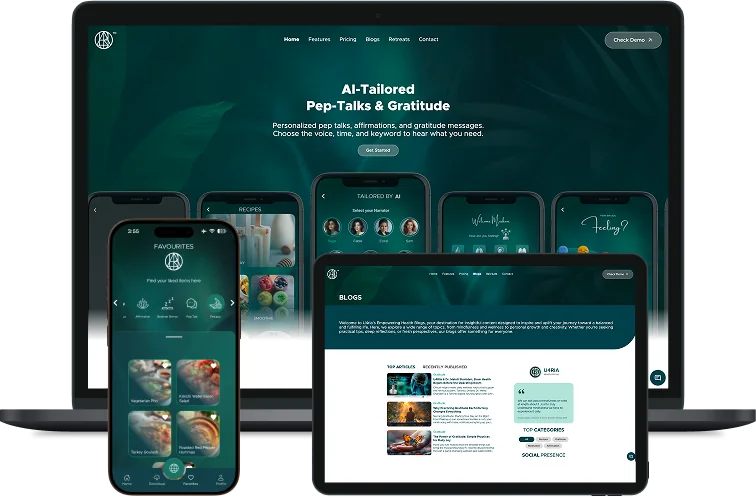
- BUILT FOR
- People making time for everyday wellbeing
- OUR ROLE
- Product design · Web development · Mobile development · AI features
- THE PRODUCT
- Web, iOS & Android
01 /THE BRIEF
A whole world of wellness. One comfortable starting point.
Someone opening a wellness app may have five minutes between meetings, want to unwind before sleep, or simply need a little encouragement. The product has to help them find an appropriate starting point without asking them to understand an entire content library first. For U4RIA, this was the central product question: how can a broad wellness offering feel personal and easy to enter?
The platform brings together sound, meditation, mood-based discovery, personalized pep talks and shared experiences. MUBBITS worked across product design, web development, mobile development and AI features to connect those parts. The work extended beyond individual screens to the journey between discovering content, using it and finding it again.
That breadth matters to the story. U4RIA is a continuing product experience rather than a single-purpose audio player. Its interface needs to support a person looking for something specific and someone who arrives without a clear idea of what they need. Both should be able to move from a first impression to a useful action.
02 /INSIDE THE EXPERIENCE
The decisions behind the screens.
Original project visuals, with the journeys and thinking that connect them.
 View full size
01 / DISCOVERY
Start with how someone feels.
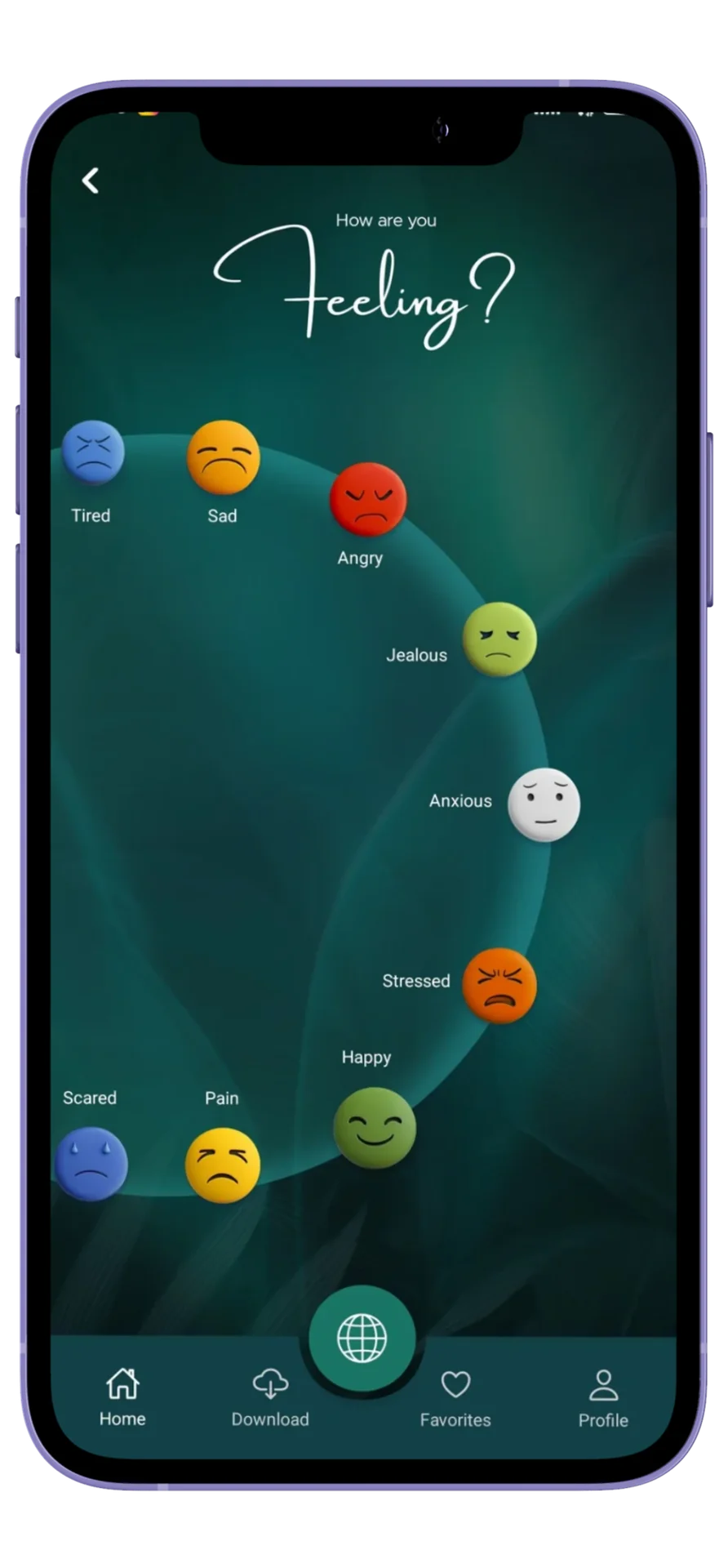
The mood experience gives people a different way into the content. Instead of beginning with a long category list, the interface presents a visual range of feelings. This creates a recognizable first interaction and connects the product’s wellness purpose to something a user can express immediately.
The design uses an emerald palette, generous spacing and a consistent navigation system to keep the interface coherent as the content changes. Mood selection belongs within that wider system: people can explore from it, move to another part of the app and still understand how to get back. The visual character is distinctive, while the task remains simple.
For a content-rich app, discovery is part of the service itself. A session buried several screens deep is less useful than one a person can identify at the right moment. U4RIA’s product structure brings the entry points closer to the reasons people open the app.
 View full size
02 / PERSONALIZATION
Make encouragement feel like a choice.
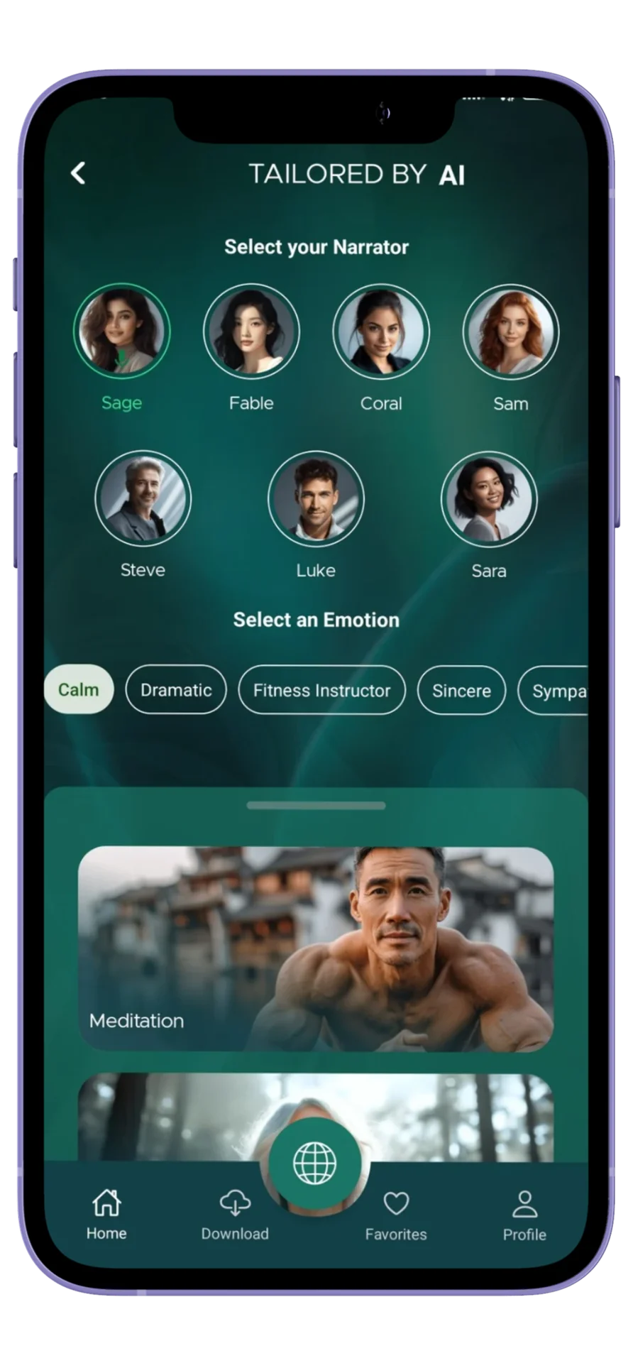
Personalized pep talks introduce a more individual layer to the experience. The product screen brings persona and emotion choices into the same flow, giving users a visible role in shaping the encouragement they receive. AI is part of a bounded product feature with a clear purpose, rather than a separate destination people have to figure out.
The interface has to make that feature understandable before someone commits to it. Grouping the choices, showing their relationship and keeping the primary action clear helps explain what personalization means in practical terms. It also gives the feature a home alongside the rest of the wellness content.
The broader lesson for a wellness product is to keep personal relevance and user control together. The product can offer a starting point, but people still need a straightforward way to browse, choose and return to experiences that suit them.
 View full size
03 / CONTINUITY
Give people reasons to come back.
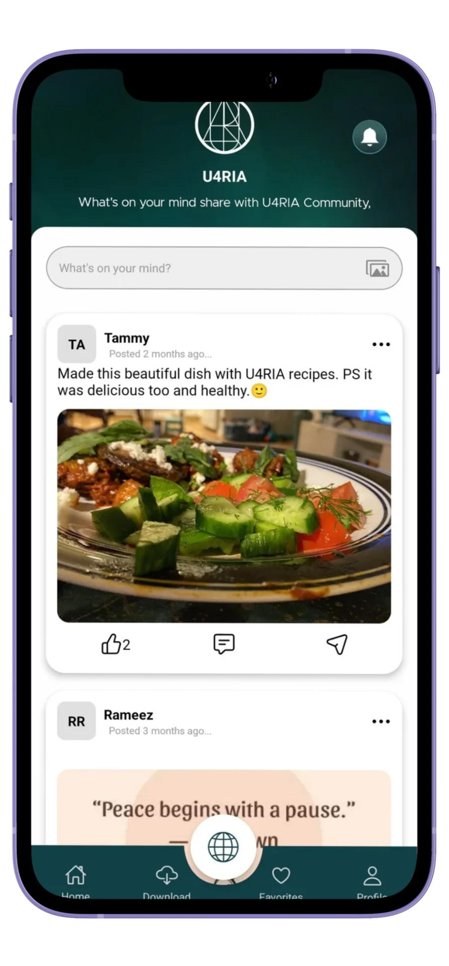
A useful wellness platform extends beyond the first session. Favorites and saved content help people return to something familiar, while the community experience introduces shared posts and another route to discovery. These features serve different needs, but they belong to the same product rather than feeling like disconnected additions.
The original community screen shows content cards, familiar engagement controls and persistent navigation. That continuity lets the visual language do some of the work: once a user understands the app’s structure, they do not have to relearn it for every content type. The interface remains recognizable as they move between personal listening and shared experiences.
This is where design and engineering meet. Screens establish the interaction pattern; the application connects navigation, content and user activity so those patterns can function across web and mobile. The result is a product people can explore over time.
03 /DESIGN MEETS ENGINEERING
The thinking beneath the interface.
Mobile and web as one product
React Native supports the mobile experience, while the web work gives the platform another point of access. Shared product language matters across those surfaces: the purpose of a feature and the way content is organized should remain recognizable even when the layout changes. Content, account state, navigation and personalization have to work together.
A connected content foundation
Node.js, Firebase and AWS form part of the project’s technical toolkit. The backend work connects the interfaces to the services behind the experience. Separating presentation from those services gives the team room to develop the content offering alongside the application, instead of treating every new experience as a separate product.
Personalization with a clear place
AI features sit within specific user journeys, including personalized encouragement. That keeps the engineering conversation focused on the feature’s inputs, output and place in the product. A useful experience needs understandable controls just as much as it needs a working integration. The interface makes that relationship visible through persona and emotion choices.
04 /THE OUTCOME
A growing product with a recognizable experience.
U4RIA has reached more than 300,000 downloads across platforms, as reported by the client. Its Canadian App Store listing showed a 4.9-star rating when checked in September 2026. Those are product milestones; the work shown here explains the design and development behind the experience rather than attributing every download to a single feature.
The delivered scope connects wellness discovery, personalized content and repeat use across web and mobile. For a founder considering a similar product, the case demonstrates why the relationships between features deserve as much attention as the features themselves. A broader library becomes more useful when people have a clear way into it.
05 /BEFORE YOUR NEXT BUILD
A little more detail.
Questions about the project and planning something similar.
What did MUBBITS work on for U4RIA?
Our scope covered product design, web development, mobile development and AI features. This case study focuses on mood-led content discovery, personalized encouragement, community and the navigation that connects them. The screenshots are original project visuals and represent the version documented here; the live app can continue to evolve.
Does MUBBITS build meditation and wellness apps?
Yes. We can help with discovery, content structure, interface design, cross-platform development and integrations for a wellness product. A useful starting brief explains the audience, the content you already have and the first activity a person should complete. From there, we can scope the player, accounts, personalization and other parts of the release.
Can you improve an existing app instead of starting again?
Yes. We can review an existing experience, identify difficult journeys and plan a focused set of improvements. For a content app, that could mean reorganizing discovery, making the player clearer or improving how people return to saved content. The right scope depends on the codebase, available content and problems your users encounter.
What should I prepare for a wellness app discussion?
Bring the product idea or current app, your audience, sample content and important platform requirements. If personalization is involved, describe what users should control and what the feature should produce. An early sketch is enough to begin; we can help turn it into a practical first-release plan.
THE CAPABILITIES BEHIND THE WORK
Where we can help you next.
YOUR PRODUCT / THE NEXT CHAPTER
Building a wellness experience of your own?
Tell us who it is for, what content you have and what a useful first session looks like. We’ll help shape the journeys, technical scope and next release.
Discuss your wellness appUsually replies within one business day.- 01Share the problem and where you are today.
- 02Talk through the users, priorities and constraints.
- 03Shape a practical scope and a clear next step.