

Reminder app modernization / CASE STUDY
Click and Go: a familiar idea, thoughtfully rebuilt.
A redesigned reminder experience, rebuilt from class-based React Native into a modern TypeScript and Expo foundation with shared UI and clearer architecture.
 THE PRODUCT IN FOCUS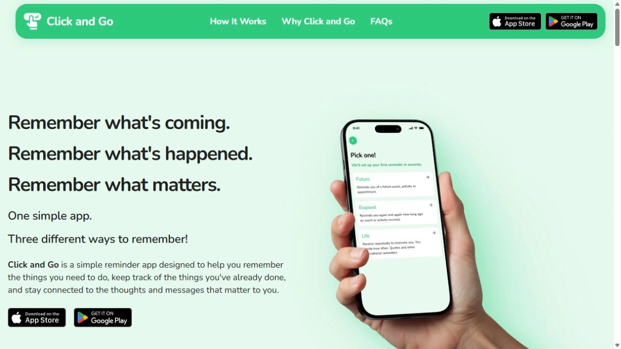
- BUILT FOR
- People managing everyday reminders, tasks and personal milestones
- OUR ROLE
- App redesign · React Native upgrade · TypeScript migration · Architecture modernization
- THE PRODUCT
- React Native mobile app · Product website
01 /THE BRIEF
Keep the purpose. Give it a stronger foundation.
Click and Go helps people remember what is coming up, see how long ago something happened and keep meaningful thoughts close. The original app brought those ideas together through reminder categories, setup steps and account tools. MUBBITS took that existing product into a new chapter with a redesigned interface and a modernized codebase.
We approached the work through the journeys that make a reminder app useful. Someone needs to understand which kind of reminder to create, choose timing and repeat settings, find an existing reminder and know what an edit or deletion means. The new experience gives those choices a more consistent hierarchy, with focused sheets, recognizable navigation and clearer explanations.
The engineering work supports that product direction. We moved from the original JavaScript and class-component implementation to a TypeScript build on React Native 0.85.3 and Expo, with function screens, dedicated hooks, shared UI and separate authentication services. We built the new experience and its engineering structure together, giving future work a coherent foundation.
02 /INSIDE THE EXPERIENCE
The decisions behind the screens.
Original project visuals, with the journeys and thinking that connect them.
 View full size
01 / A CLEARER START
Explain the choice before asking for the details.
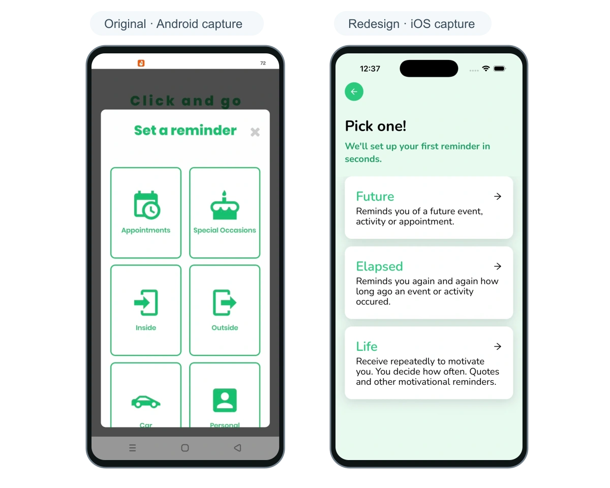
The original reminder menu presents a grid of categories, including appointments, special occasions and other activities. The redesigned choice screen organizes the starting decision around Future, Elapsed and Life. Each option includes a short explanation of what the reminder means.
Future points toward an upcoming event. Elapsed looks back at an activity and the time since it happened. Life gives repeated personal reminders a place of their own. Those distinctions reflect the product’s broader purpose and help someone decide where their situation belongs.
These captures show the starting choices in the original Android journey and the redesigned iOS journey. The complete interfaces are preserved, including their platform-specific controls.
View full size02 / THE DAILY EXPERIENCE
Bring the app’s different kinds of remembering together.
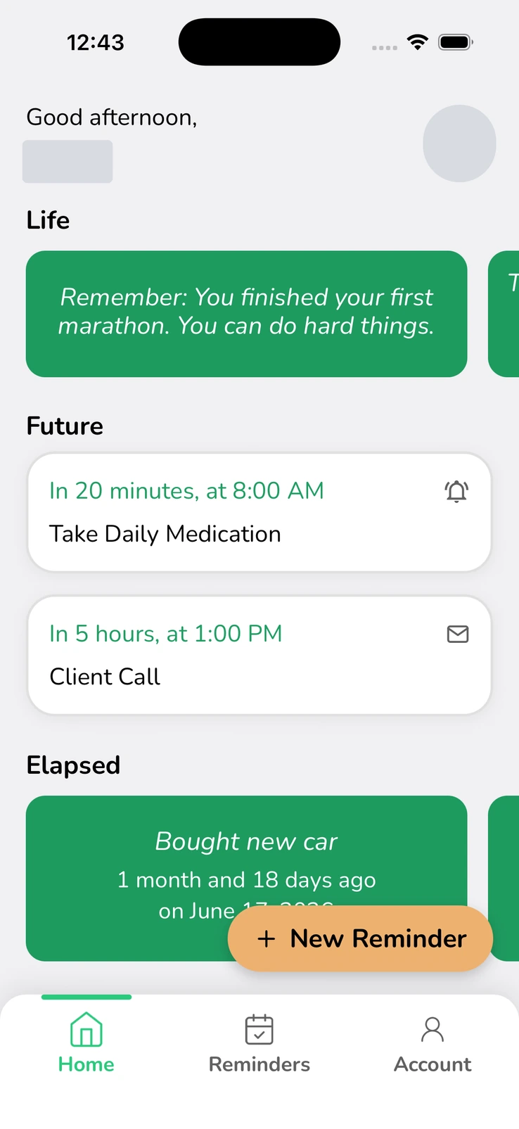
The redesigned home screen gives Life, Future and Elapsed activity distinct sections within one view. Upcoming reminders include their time context, title and delivery-method icon. Personal reminders and elapsed activity use a separate card treatment, so the kinds of information remain recognizable.
A New Reminder action sits close to the working content. Home, Reminders and Account form the bottom navigation. The layout gives someone a practical route back to their activity while retaining Click and Go’s familiar green identity.
The screen uses demonstration reminders to show the different kinds of activity together. The supplied name and avatar are masked for privacy.
View full size03 / FOCUSED REMINDER CONTROLS
Make one timing decision at a time.
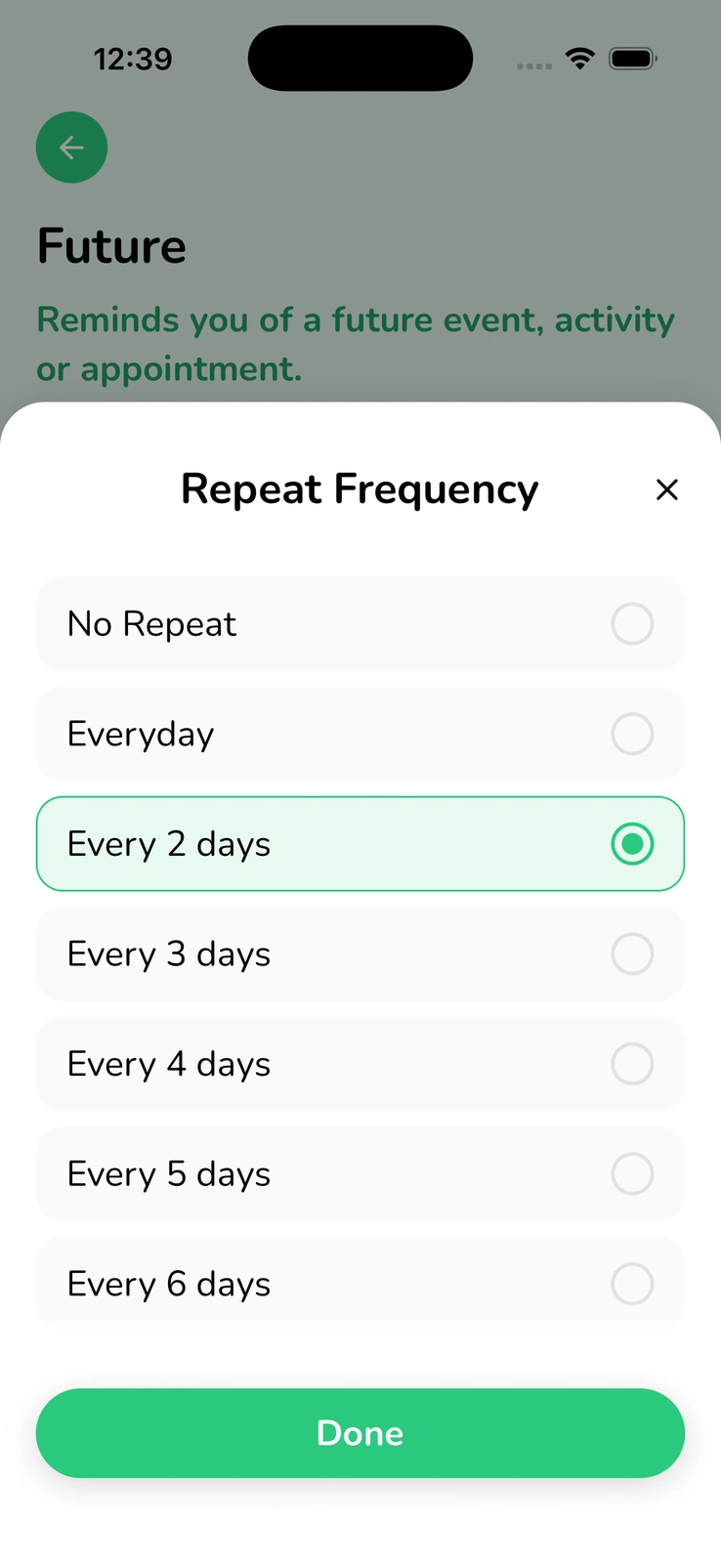
Repeat frequency and advance-reminder choices use focused sheets in the redesigned experience. The supplied repeat screen shows a selected option, other available intervals and a clear Done action. The reminder context remains visible behind the sheet.
We built a reusable bottom-sheet component with typed props, shared styling, animated transitions and safe-area spacing. Related settings can use the same interaction pattern, while the screen-specific hooks manage their own values and actions.
This is where the team’s extra care becomes tangible. A new feature can draw on the same buttons, inputs, typography and selection controls instead of introducing another visual vocabulary. Consistency becomes part of the implementation as well as the design.
 View full size
04 / THE DETAIL VIEW
Show the reminder and the choices behind it.
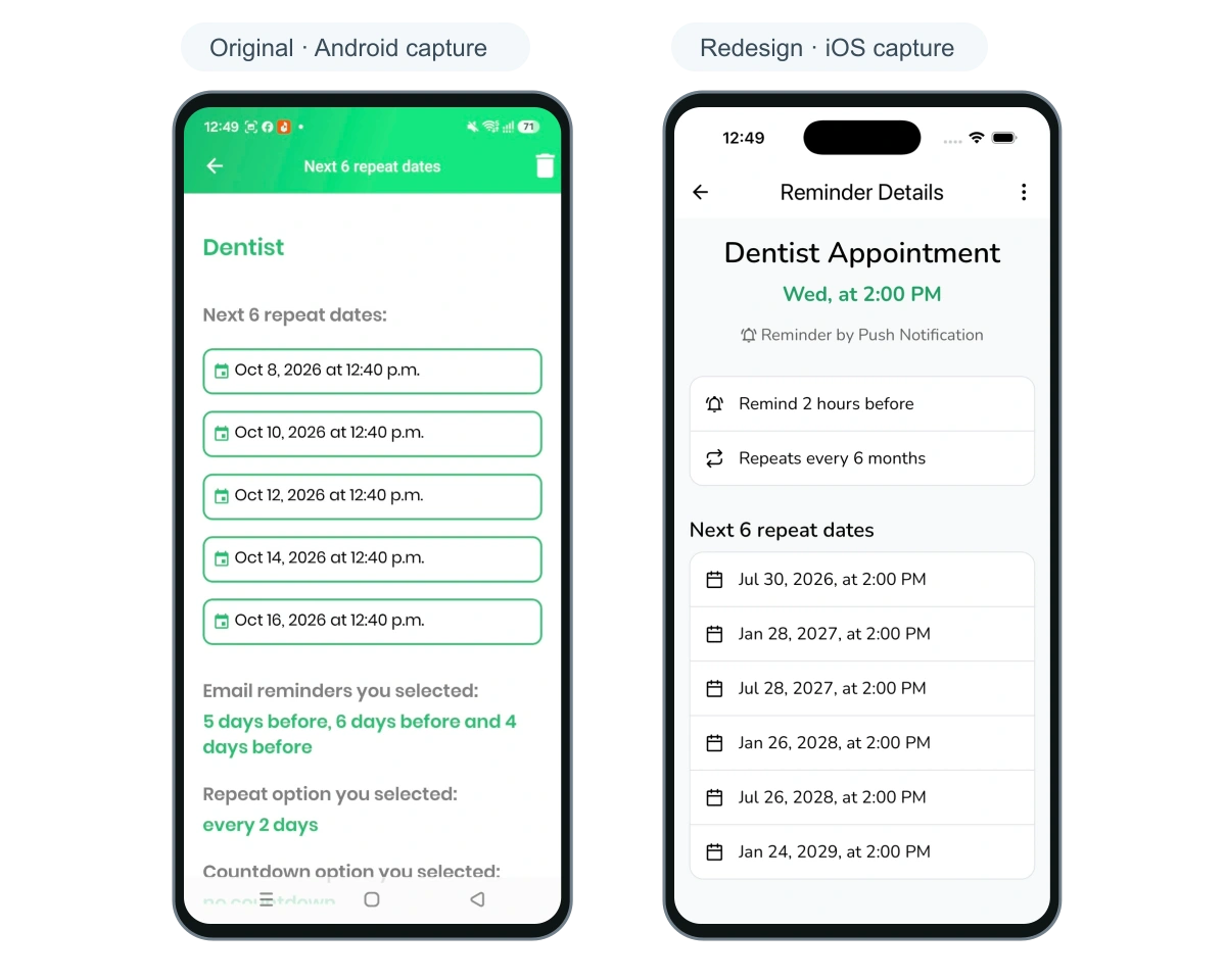
The old detail capture shows a dentist reminder, upcoming dates and the selected advance reminders. The redesigned detail view keeps the appointment title, time, delivery method, reminder lead time and repeat frequency together above the upcoming dates.
The sample schedules differ between these captures. The information hierarchy shows the design change: a person can see the reminder’s meaning and its selected settings before reviewing the repeat list.
The redesigned edit and delete controls continue that approach. The deletion dialog explains the effect on upcoming occurrences and gives the person a clear confirmation choice. These working states received the same design attention as onboarding and home.
 View full size
05 / FIND WHAT MATTERS
Give filtering and sorting a working home.
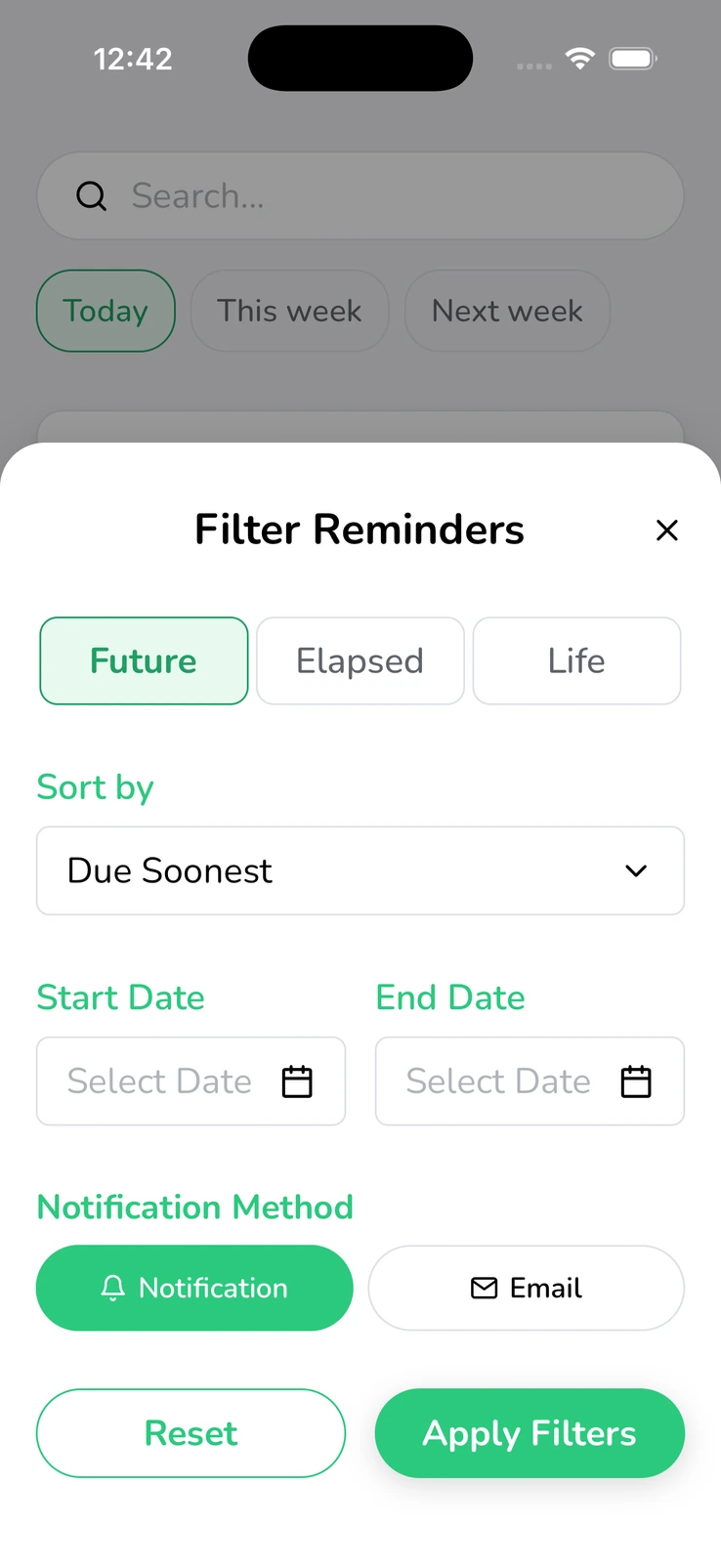
The old app exposes date, alphabetical, countdown and repeat routes through a tile menu. The redesigned filter sheet groups reminder type, sort order, a date range and delivery method. Reset and Apply Filters sit together at the end of the decision.
A separate sorting sheet explains choices such as due soonest, due latest, alphabetical order and recently added. The controls make the intended organization visible instead of asking someone to infer it from an icon.
Dedicated reminder-screen hooks organize search, tab selection and filter state. The interface and its underlying state structure received attention together, giving the team defined places to develop these journeys further.
03 /DESIGN MEETS ENGINEERING
The thinking beneath the interface.
A newer React Native and Expo foundation
We moved the build from React Native 0.68.1 and React 17.0.2 to React Native 0.85.3, React 19.2.3 and Expo 56. Expo Router provides the entry and route structure, supporting the new organization of the app’s journeys.
Function screens and dedicated hooks
Class-based Login and Home containers give way to function screens and dedicated hooks such as useLogin and useHome. Screens render the interface, hooks collect state and actions, and shared components provide the controls. The separation makes each responsibility easier to locate when the app changes.
TypeScript with explicit shared contracts
The new project enables strict TypeScript checking and defines interfaces for user documents, authentication state and UI props. Those shared contracts help expose mismatched fields and callback expectations during development, while runtime handling remains part of the integration work.
Authentication services and shared session state
Sign-in hooks call a separate authentication service and fetcher layer. A typed Zustand authentication store distinguishes storage hydration, Firebase initialization and user-document state. It selectively persists onboarding state while Firebase handles session restoration, making each part of startup explicit.
Reusable interaction details
Shared bottom sheets, selection controls, buttons, typography and safe-area handling connect the visual redesign to reusable implementation. Reanimated transitions are part of the sheet component. The extra effort extends through settings, errors and confirmation states, giving the product a more consistent foundation for further work.
04 /THE OUTCOME
A clearer experience, with engineering behind it.
Click and Go’s redesigned build presents its reminder ideas through a cohesive interface, focused settings and a readable detail view. The supplied old and new screens make that transformation visible, while the source establishes the move to TypeScript, function components, dedicated hooks and an Expo-based foundation.
Our engineering team went above and beyond by carrying the same care through reminder settings, form states, confirmation dialogs and reusable controls. Future development has clearer places for screen logic, account state, authentication requests and shared UI. The new experience and its structure reinforce each other.
This case study covers the redesign and architecture stage. The build uses demonstration reminder data and local subscription state; reminder delivery, live billing and release of the redesigned binary need separate verification. The linked website and stores identify the existing public product.
05 /BEFORE YOUR NEXT BUILD
A little more detail.
Questions about the project and planning something similar.
What did MUBBITS change?
We redesigned the mobile experience and modernized the original React Native implementation with TypeScript, function screens, dedicated hooks, shared UI, Expo Router and Zustand state. The before-and-after screens show how that work carries through the product.
Why move away from class components?
Function components and dedicated hooks fit the new screen structure and make state and actions easier to organize. Class components remain supported by React; the decision followed this project’s modernization scope rather than a claim that every class-based app needs a rewrite.
Do the public store links show the redesigned build?
They identify Click and Go’s existing public listings. The supplied simulator screens and reviewed checkout document the redesign stage; we have not established that the redesigned binary is the version currently available in those stores.
Can you modernize our existing app too?
Start with the current repository, representative screens, important user journeys and the intended release scope. We can help define the interface improvements, architecture work, integration needs and verification that belong in the next phase.
THE CAPABILITIES BEHIND THE WORK
Where we can help you next.
Mobile app modernization
React Native upgrades, app architecture and a practical scope for the next release.
Product and interface design
Clearer journeys, consistent controls and a visual language that carries through the app.
Testing and release support
Device checks, integration evidence and preparation for the release your product needs.
YOUR PRODUCT / THE NEXT CHAPTER
Give your app its next chapter.
Bring the current product, the screens people rely on and the changes your team wants to make. We can help shape a modernization that connects the experience to the engineering behind it.
Discuss your app modernizationUsually replies within one business day.- 01Share the problem and where you are today.
- 02Talk through the users, priorities and constraints.
- 03Shape a practical scope and a clear next step.