

We transformed Click and Go from an older, class-based React Native app into a redesigned mobile experience with a modern TypeScript foundation. The work brought together two responsibilities: make the reminder app easier to understand, and give the engineering team a clearer structure for developing it.
The original app already had a distinctive purpose. It helped people remember upcoming events, keep track of how long ago something happened, and return to things they wanted to remember. Our job was to carry that purpose forward through a more considered interface and a reorganized implementation. Here is how the old and new experiences compare, and what changed beneath the screens.
Key takeaways
- Modernization connected the product redesign to a move from React Native 0.68.1 to the reviewed build’s React Native 0.85.3 and Expo foundation.
- Function components, dedicated screen hooks, shared UI and service boundaries give the new code a more explicit organization.
- Strict TypeScript adds useful checking, while runtime validation and complete release verification remain separate responsibilities.
- The team carried the redesign through repeat settings, filters, validation and confirmation states, giving the small details the same care as the first screen.
Start with the purpose people already understood
Click and Go’s value lives in everyday situations: an appointment coming up, a task that repeats, something completed weeks ago, or a personal achievement worth remembering. The old screenshots show those ideas spread across onboarding cards, category menus and reminder-setup steps. There was a useful product to preserve.
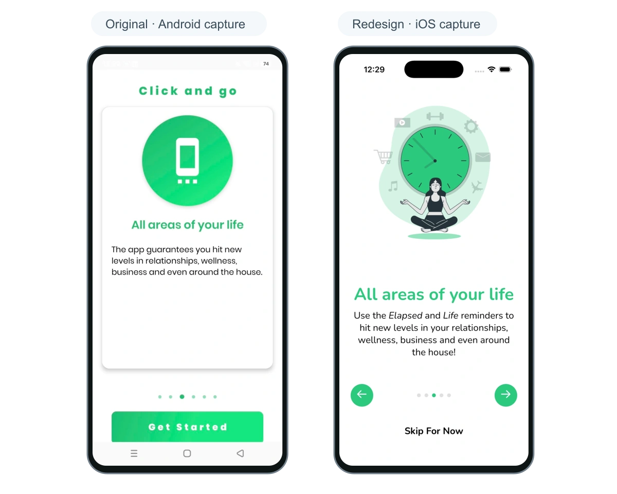
We kept that broad purpose and gave the redesigned app a clearer visual language. Green remains recognizable, while softer surfaces, more consistent spacing, calmer typography and focused illustrations create a more cohesive experience. The new onboarding explains the reminder ideas through distinct illustrations and shorter passages, then leads toward the first reminder.
This is a useful starting point for an existing-app project. Identify the behavior users came for before choosing which screens to replace. A redesign should help a person recognize the product and understand their next action. The examples here are owner-supplied captures of the old Android app and the new iOS simulator build, so platform-specific status bars and controls should be considered separately from our interface decisions.
Explore the complete Click and Go work story
A familiar purpose, a clearer introduction
Organize the experience around Future, Elapsed and Life
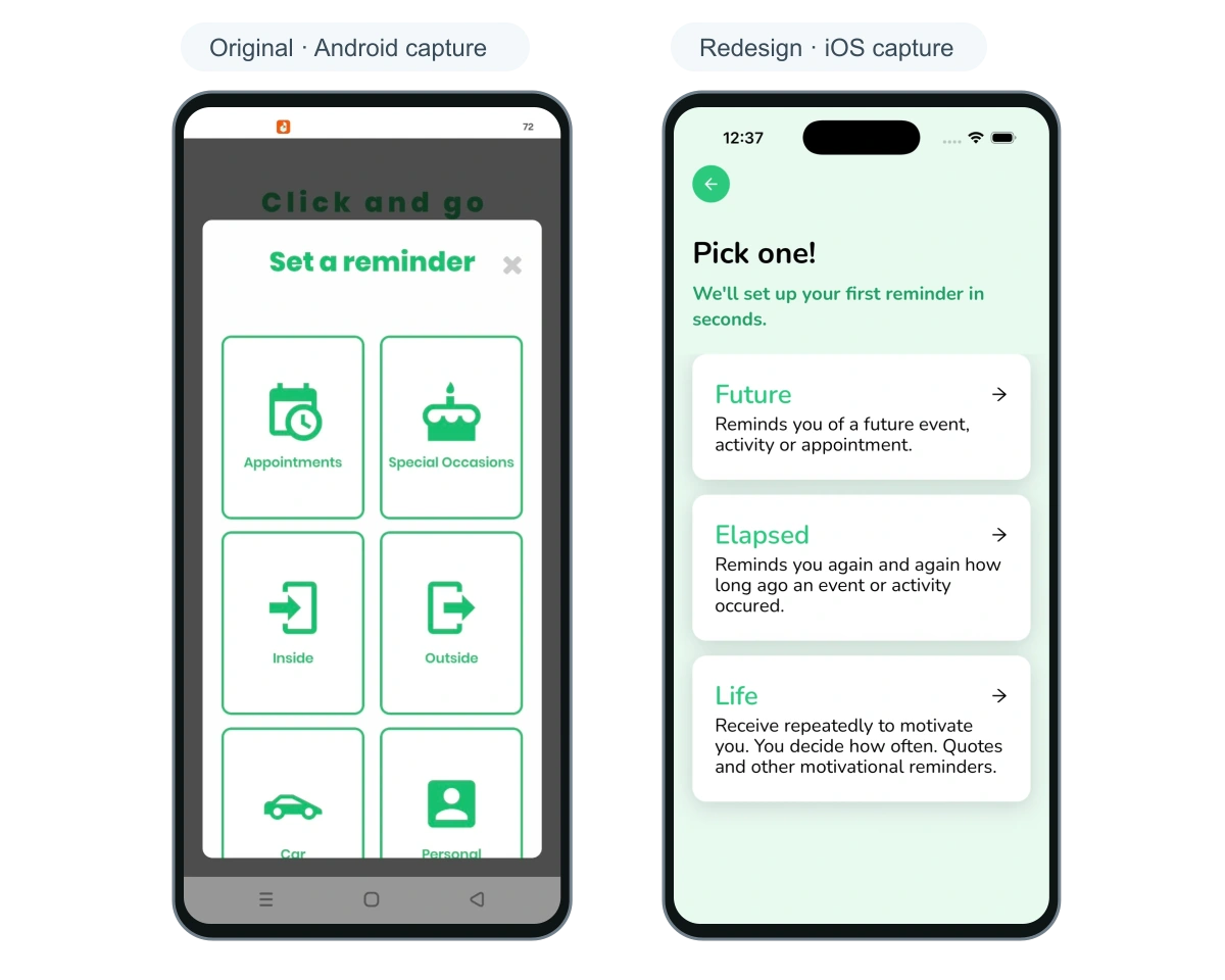
The redesigned reminder choice gives three ideas a clear name and explanation. Future is for an event, activity or appointment that has not happened yet. Elapsed looks back at something that happened and makes the passage of time visible. Life holds the things a person wants to remember repeatedly, including a quote or an accomplishment.
That structure carries into the redesigned home screen. Upcoming reminders sit beside elapsed activity and personal reminders, with a clear New Reminder action. Home, Reminders and Account provide recognizable places to return to. The screen presents the product’s different kinds of remembering within one daily-use experience.
The supplied old reminder menu uses a grid of categories. The new choice screen explains the meaning of each reminder type before asking for details. Those screens are not identical steps in the two flows, but they show the change in emphasis: from selecting a category to understanding the kind of reminder being created. For a founder reviewing a redesign, this is a concrete question to ask: can someone explain their next choice from the screen itself?
Explain what kind of reminder someone is creating
Give the details the same care as the first screen
A reminder app has many small decisions: when something happens, how often it repeats, how far in advance to be reminded, and which delivery method to choose. The redesigned build groups these decisions in focused sheets, with selected states and a clear Done action. A person can work through one setting while retaining the context of the reminder beneath it.
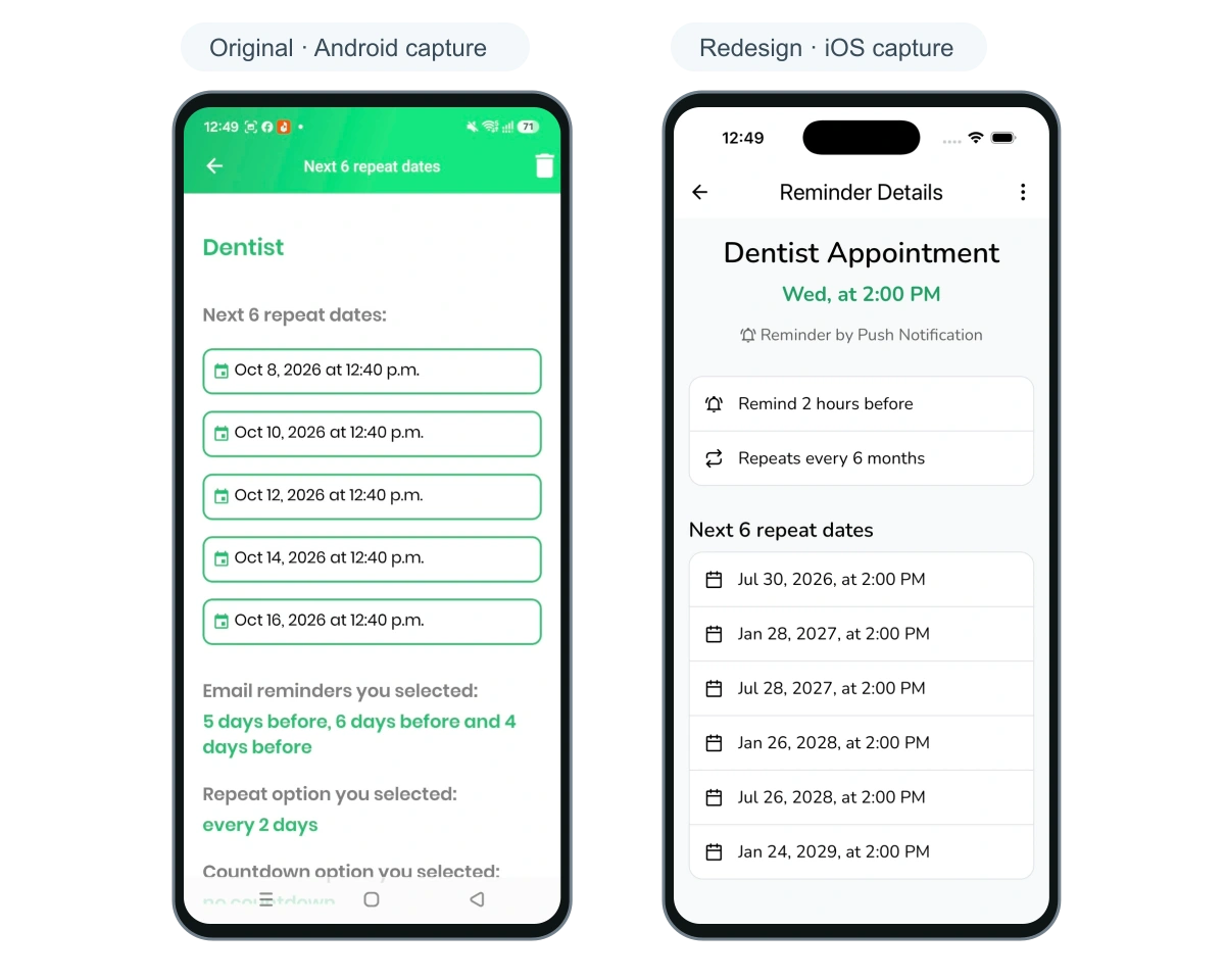
The detail view brings an appointment title, time, delivery method, advance reminder, repeat frequency and upcoming repeat dates into one readable hierarchy. Filters group reminder type, sorting, date range and notification method. The delete confirmation explains that the reminder and its upcoming occurrences will be removed. These are specific interface decisions that extend the redesign through the working journey.
Our engineering team’s extra care is visible in the shared implementation too. The BottomSheetModal component uses the same presentation pattern, Reanimated transitions and safe-area spacing across choices. Reusable buttons, inputs, typography and selection controls give related screens a common vocabulary. Building that vocabulary alongside the screens helps future changes remain coherent.
How a design system connects product decisions to reusable UI
Keep the reminder’s settings close to its meaning
Move from class components to a TypeScript architecture
The original app used React Native 0.68.1 and React 17.0.2. Its Login and Home screens combined class components, component state and lifecycle methods. For this rebuild, we chose function components and hooks to give the new screen structure a clearer separation of responsibilities. React continues to support class components and recommends functions for new code.
We brought the new build onto React Native 0.85.3, React 19.2.3, Expo 56 and Expo Router, and moved the implementation to TypeScript with strict checking enabled. Updating the framework foundation and reorganizing the application together gave us a consistent starting point for the redesigned journeys.
The architecture gives responsibilities a visible home. Route files organize navigation. Function screens render the interface. Dedicated hooks such as useLogin and useHome manage the screen’s state and actions. Authentication hooks call fetcher functions, while shared Zustand stores hold session and application state. Constants, styles, utilities and reusable UI components sit alongside those layers.
TypeScript makes interfaces such as UserDocument, authentication state and component props explicit. If a component expects a callback with a particular argument, or a shared model expects a field, the compiler can highlight a mismatch during development. That helps the team work with contracts they can inspect as the app evolves. Remote data and user input still need runtime handling; the migration also leaves some any-typed state to refine.
| Area | Original app | Modernized build |
|---|---|---|
| Framework foundation | React Native 0.68.1; React 17.0.2 | React Native 0.85.3; React 19.2.3; Expo 56 |
| Language and checks | JavaScript screens | TypeScript; strict compiler configuration |
| Screen structure | Class-based Login and Home containers | Function screens with dedicated hooks and styles |
| Navigation | React Navigation 4 dependencies | Expo Router entry and route files |
| Shared state | Component state and an existing class-based context | Zustand authentication and application stores |
| Interface building blocks | Existing app components and theme files | Shared typed UI, bottom sheets and selection controls |
Give your existing app a stronger next chapter.
Bring the current repository, important screens and the changes your users need. We can help connect a clearer experience to a practical engineering and release scope.
Make account and loading behavior explicit
Sign-in shows how the new organization works in practice. The screen renders the form and consumes useLogin. The hook manages field errors and the next navigation decision. The authentication service performs the request and returns an outcome. When a field, an authentication result or the next screen changes, the team has a defined place to make that change.
The shared authentication store distinguishes storage hydration from Firebase authentication initialization. It also represents an unknown new-account state separately from a known value. These distinctions give navigation code meaningful information while the app is starting and make loading behavior an explicit part of the architecture.
The root layout listens for authentication and user-document changes. The store selectively persists onboarding-related state, while the Firebase SDK remains responsible for restoring its session. That division keeps responsibility for each part of startup visible to the team.
A React Native upgrade also reaches beyond screens into native dependencies and project configuration. We included Expo in the new foundation and kept native-module compatibility and release verification in the broader modernization scope. An app’s next chapter needs both a coherent implementation and a clear path through its device and integration checks.
What makes this transformation special
Our engineering team went above and beyond by carrying the product thinking into the details people use every day. A repeat setting has a clear selected state and a Done action. A deletion explains its effect. Sign-in has validation and loading states. Each of those moments received attention, alongside the larger changes to onboarding, home and reminder creation.
The same care runs through the implementation. Shared sheets and controls support the redesigned journeys. Dedicated hooks organize screen behavior. Authentication services and typed account state have defined responsibilities. We built the visual language and the engineering structure together, so the next feature has something coherent to build on. That combination is what makes this transformation special.
This story documents the redesign and architecture stage. The build shown here uses demonstration reminder data and local subscription state; reminder delivery, live billing and release of the redesigned binary need separate verification. The existing public store listings identify the product, while the screenshots show the new experience in development.
For an older app of your own, a useful modernization brief connects the two sides of the work. Name the journeys that should improve, the existing behavior that must survive, the code boundaries that need attention and the evidence needed before release. If your React Native app is ready for its next chapter, MUBBITS can help shape that scope around your product and its release requirements.
Frequently asked questions
Did Click and Go change frameworks?
It remains a React Native app. The reviewed implementation moves from React Native 0.68.1 to 0.85.3 and adds an Expo and Expo Router foundation alongside TypeScript and a reorganized screen, hook, service and state structure.
Does moving to TypeScript make an app automatically production-ready?
No. TypeScript helps check code during development. Runtime validation, reminder delivery, billing, data compatibility and device-specific behavior need their own implementation and verification before a release.
What should a founder provide for an app modernization?
Start with the existing repository, representative screens, the journeys users rely on and the intended release scope. Access to a test environment and a clear account of integrations help the team distinguish interface work, architecture work and release verification.
Let’s work through your next step.
Tell us what you’re building, what you’ve tried, and where you need a hand. We’ll work with you to define a practical way forward.