

A few short prompts were enough to give Astra a clear direction for a FloorPlanz Pro motion graphics video. Our estimate was about 15 minutes for the initial creative pass with HyperFrames. The finished example below also includes later feedback on the background and a cleanup pass, so that estimate is not the elapsed time for every revision, render and review.
The result is a 32-second iPad product film: draw a floor plan, choose a carpet roll width, reveal the cuts, and export an installer-ready sheet. This step-by-step HyperFrames tutorial explains what we supplied, how the prompts developed, and what the agent built. You can inspect real frames along the way and watch the final video at the end.
Key takeaways
- Start with authentic product screens, an audience and one clear outcome.
- Use a short creative prompt, then give specific feedback on the actual preview.
- Keep motion and sound on a shared timing plan; preserve readable holds between transitions.
- Review the exported file. A fast creative draft and a finished delivery are different milestones.
Step 1: Give Astra the real product and its visual identity
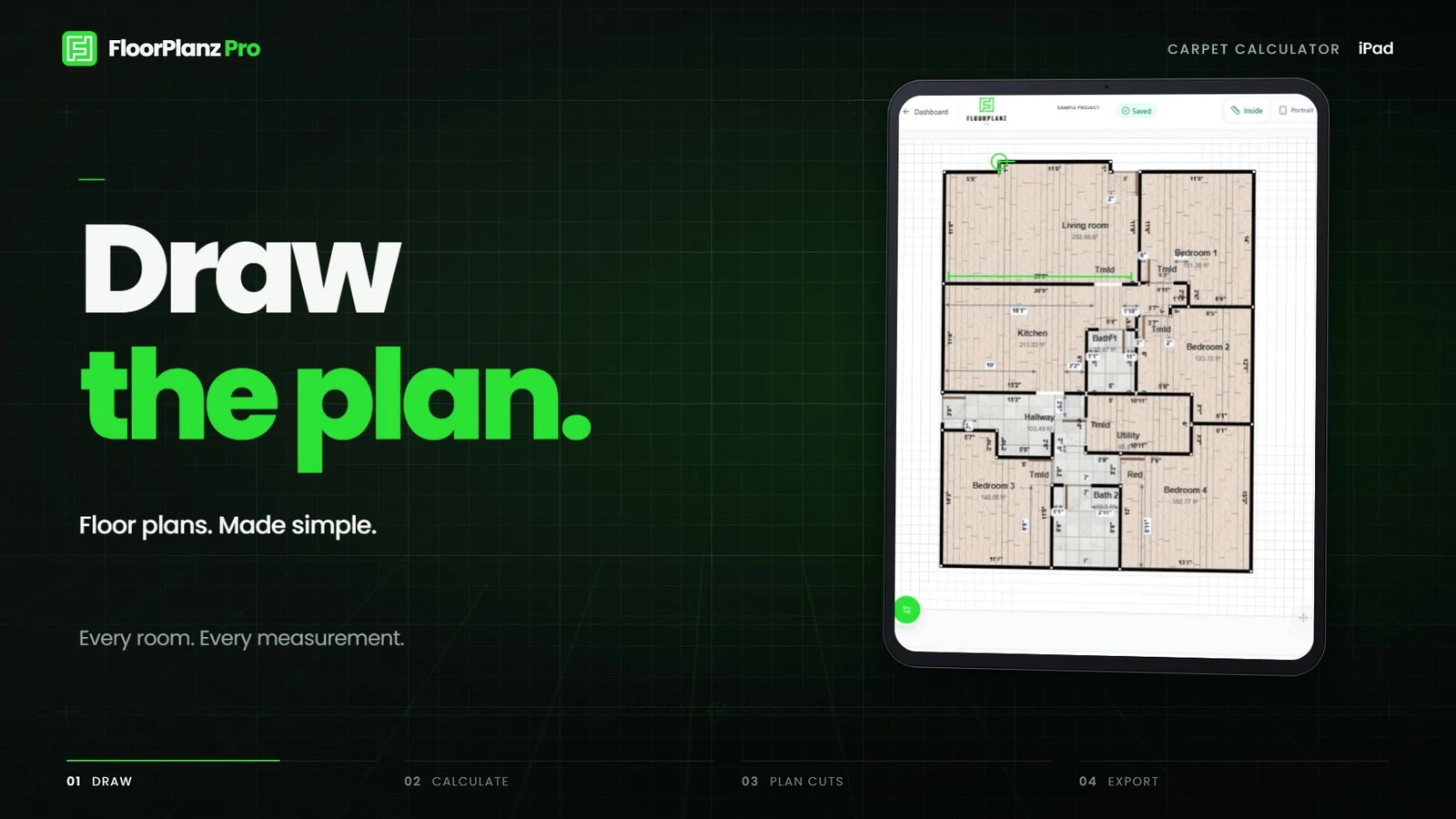
We worked inside the existing FloorPlanz project, where the iPad screens, logo and brand choices were already available. That context matters: a short prompt is more useful when the agent can inspect the product than when it has to guess what the interface does. Our source material covered the drawing screen, carpet calculator, colored layout and PDF cut sheet.
The audience was flooring professionals and carpet installers. The promise was already settled: Draw the plan. Calculate the carpet. Simple. We kept the green, graphite and white palette and Poppins typography. The film presents the interface inside an iPad, with larger views of individual controls when the audience needs to read them.
For your own project, collect four or five screens that show a complete task. Use approved sample data and remove private details before supplying the files. Label which screen represents the input, the decision and the output. A beautiful dashboard that does not explain the task is a weak starting point for a product film.
Explore the FloorPlanz Pro product case study
A real product screen anchors the film
Step 2: Start with a short motion graphics prompt
Our original request asked for an ambitious video of the iPad carpet calculator, with music, pops, whooshes, camera motion and typing animations synchronized. It did not contain a long shot list. Astra turned that direction into a 32-second landscape treatment with four eight-second sequences.
The prompt below is an edited, reusable version of that request. We have made the context and deliverables explicit for readers; it is not a verbatim transcript or a claim that these exact words generated the file. Replace the product details with your own evidence.
HyperFrames supplies the video workflow and rendering environment; the agent builds the composition from code. Its official product-video guide is the relevant route for a complete app promo. The shorter motion-graphic workflow is useful for individual title, logo or statistic beats. You can begin with the official quickstart if the framework is not already installed.
Prompt 1: Build the product film
Edited from our initial FloorPlanz request; use after supplying approved product assets.
Using HyperFrames, create a premium motion graphics video for the FloorPlanz Pro carpet calculator on iPad. Show the real drawing screen, carpet controls, cut layout and PDF output. Preserve our logo, green/graphite palette and Poppins type.

Go bold with camera moves, close-ups and typing animations. Synchronize music, pops, taps and whooshes with the visual actions. Keep the UI and main message readable. Use only real features and approved sample values.

End on: Draw the plan. Calculate the carpet. Simple. Deliver a landscape MP4 and keep the editable source.Step 3: Turn the product journey into four timed scenes
The useful story was already in the product: a drawing becomes a material plan and then a practical document. Astra mapped it into four scenes rather than trying to show every available feature. The table records the actual structure of this film.
The project uses a 120 BPM timing grid. At that tempo, a beat lasts half a second; in 4/4, four bars last eight seconds. Each scene therefore has space for an entrance, an important action and a readable hold before the next cut. The four scenes total 32 seconds. This is the timing choice for this project, not a universal recipe for product videos.
The source is editable HTML, CSS and animation code with local scene timelines. The parent composition places the scenes at 0, 8, 16 and 24 seconds and owns the audio cues. That arrangement makes a targeted revision possible without shifting the entire film by accident.
| Time | Product evidence | Motion and message |
|---|---|---|
| 0–8 seconds | Real floor-plan screen inside an iPad | Typed opening, device reveal and a closer view of the drawing. |
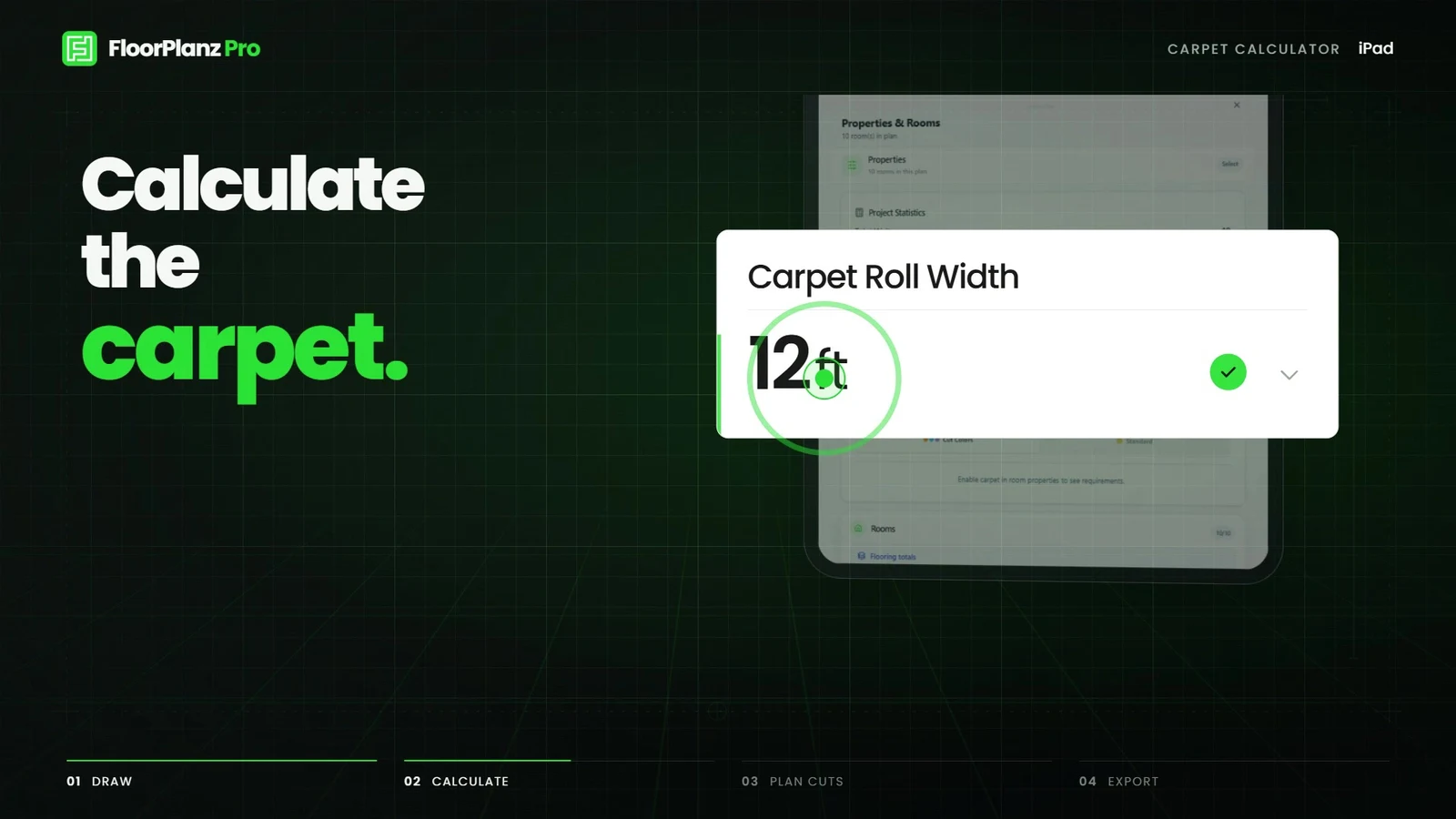
| 8–16 seconds | Carpet Roll Width control and 12 ft sample selection | A camera push and enlarged control make the selection readable. |
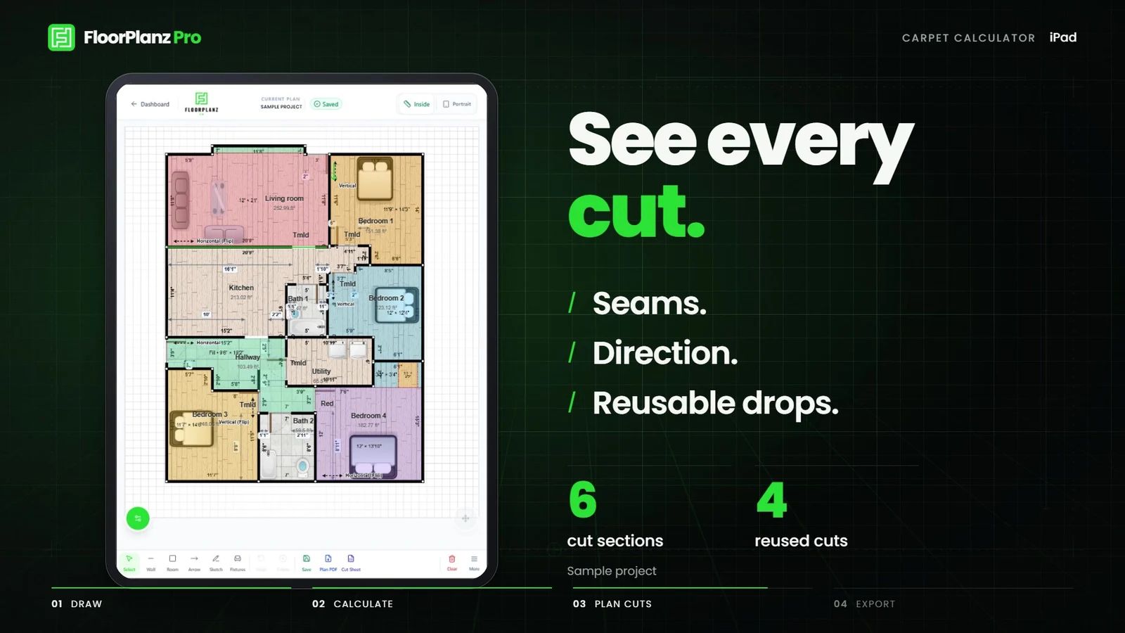
| 16–24 seconds | Color-coded carpet layout | Cuts appear in rhythm; sample-project counts stay labeled as examples. |
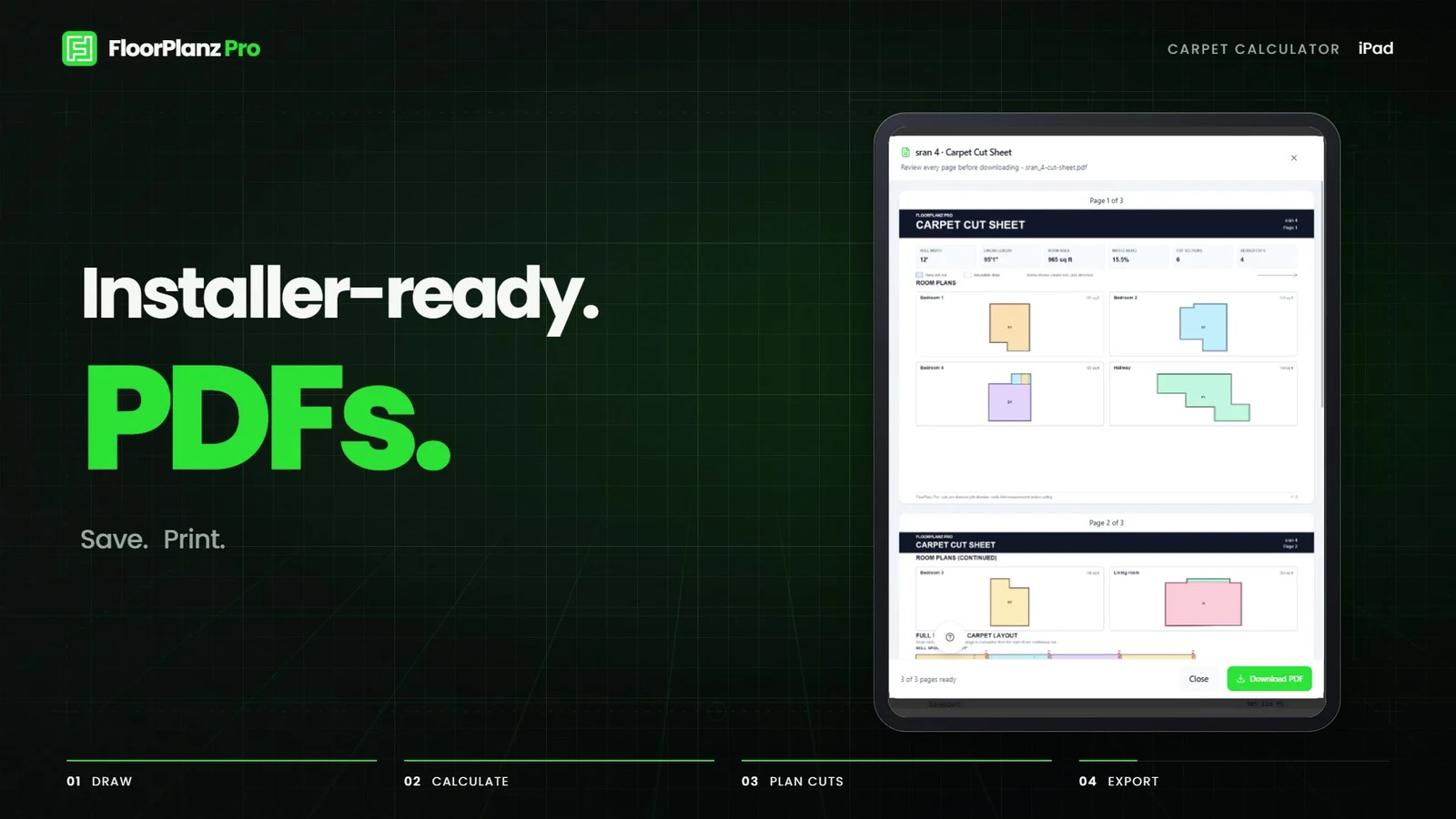
| 24–32 seconds | Installer cut sheet and PDF action | Output reveal, green Simple. moment and a calm brand ending. |
Bring the important control closer
Step 4: Give one concrete art-direction correction
The first treatment felt too plain against a dark background. Our next prompt asked for a grid or another visual element to add character. The revision used drafting grids, perspective guides and restrained green lighting around the tablet. Those elements connect to the act of planning a room, rather than adding unrelated decoration.
This is a useful feedback pattern: identify the weak part, describe the desired feeling, and protect the parts that already work. If you ask the agent to improve everything, it may change the typography, pacing or product details you had already approved.
The frame below comes from the cleaned final MP4. It shows the result of the background direction, not a screenshot of the chat or a fabricated interface.
Prompt 2: Improve the background
Edited from our feedback that the plain black background needed more character.
The dark background feels too plain. Give it an architectural drafting treatment with a fine grid, subtle perspective guides and restrained green light behind the iPad. Keep the real product screen, brand colors, scene order and audio timing. The background should add depth while the UI and text stay easy to read.A drafting background with a product purpose
Give your product a story people can follow.
Bring your app, approved screens and the journey you want to explain. We can help shape the product design and a clear visual brief.
Step 5: Inspect the interface and request a precise cleanup
The review caught a floating help icon covering parts of the interface in several source screens. We asked for it to be removed. The final film uses aligned compositing to clean those areas while preserving the original source screenshots and the established camera motion.
That correction is presentation cleanup. It does not authorize invented features, changed calculator values or a claim that the demo proves material savings. The visible cut counts belong to a sample project. Keep that distinction when a product screen contains numbers that could otherwise look like customer results.
Review both a full-speed playback and still frames around close-ups. Check control labels, device proportions, text clipping, abrupt transitions and the final brand hold. A single attractive poster cannot establish that all 32 seconds work.
Prompt 3: Clean up a distracting overlay
Edited from the request to remove help icons covering the UI.
The floating help icon and its shadow cover the UI in some shots. Remove them from the affected drawing, calculator and carpet-layout scenes. Preserve the underlying product content, screen proportions, camera transforms, timing and soundtrack. Check the close-ups and scene transitions, then export the corrected MP4.End the workflow with a useful output
Step 6: Check the export and keep the editable project
The delivered file is H.264 video at 1920 × 1080, 30 frames per second and exactly 32 seconds, with stereo AAC audio. Its 960 frames match that duration and frame rate. The project includes an original electronic score and separately timed sound effects. It has no spoken narration; the designed on-screen text carries the message.
Keep the source composition, assets and cue timing with the export. They make it easier to replace one screenshot after a product update or prepare a separately reviewed portrait version. Cropping a landscape film automatically can remove the interface or its explanation.
The lesson from our roughly 15-minute creative pass is that a prepared product context and a few useful prompts can move the first build forward quickly. Final quality still depends on reviewing what the viewer will actually see and hear. Our later background and help-icon revisions are part of that story, not something to hide behind a speed claim.
Frequently asked questions
Are these the exact prompts from the chat?
They are edited versions of the three real requests: create an ambitious synchronized iPad promo, improve the plain background, and remove help icons covering the UI. We expanded the context so a reader can reuse them. The screenshots and embedded MP4 are from the actual project.
Did the final reviewed video take exactly 15 minutes?
No stopwatch benchmark is claimed. About 15 minutes is our estimate for the initial creative pass. The embedded file includes later background changes, cleanup, rendering and review. Production time varies with assets, hardware and revisions.
Can I use this workflow for a SaaS demo?
Yes, the same briefing approach can describe a real browser workflow: show the starting state, the important action and its result. Use a browser or desktop presentation for web software and preserve authentic screens. Plan a different composition for each required aspect ratio.
Watch the finished video
The final cleaned FloorPlanz Pro film, built with Astra and HyperFrames. 32 seconds, 1080p, music and sound effects; no spoken narration. This version includes the later background and help-icon refinements.
Video description and on-screen text
0–8 seconds: “Draw the plan.” appears with a floor outline, followed by an iPad showing the real drawing screen. Supporting text reads “Floor plans. Made simple.” and “Every room. Every measurement.”
8–16 seconds: “Calculate the carpet.” introduces the calculator. A close-up highlights “Carpet Roll Width” and a 12 ft selection, followed by the cut-color control.
16–24 seconds: “See every cut.” accompanies the real color-coded layout. The words “Seams.”, “Direction.” and “Reusable drops.” appear. Six cut sections and four reused cuts describe the labeled sample project, not a customer saving.
24–32 seconds: “Installer-ready.” and “PDFs.” introduce the cut sheet with “Save. Print. Share.” A green “Simple.” transition leads to the FloorPlanz Pro logo, “Draw the plan. Calculate the carpet. Simple.” and floorplanzpro.com. Electronic music and timed typing, tap, pop and whoosh effects play throughout; there is no dialogue.
Let’s work through your next step.
Tell us what you’re building, what you’ve tried, and where you need a hand. We’ll work with you to define a practical way forward.